

Do "Paint Color of the Year" Announcements Mean Anything?
And Why Benjamin Moore "won" this year or whatever.

Around this time of year, the paint industry begins announcing their “Color of the Year” selects, which should really be termed “Color of Next Year” because their releases are for the year ahead. It’s the industry’s equivalent to putting Halloween candy in CVS mid-August, which, while slightly annoying, is effective.
These announcements are extremely valuable to paint companies because:
Decor media jumps on them, resulting in valuable promotion for businesses like Behr, Benjamin Moore, etc.
And decor media benefits as well — color news stories perform well on social and news platforms, and it’s always in a publisher’s best interest to offer a gesture of goodwill to paint companies in the hope of landing one as a sponsor. In the world of decor media, paint sponsors are among the most coveted (they can spend serious money), but are also the most difficult to land (they like to spend serious money in the same places every year). (Come to me, paint sponsors.)
In the scope of tools and materials available to homeowners and renters, paint is critical. I’m really not kidding; paint is the most accessible and affordable apparatus for changing one’s space. The color you select for your walls becomes the literal backdrop of your life, and as mundane as that hue might feel after seeing it 365 days a year for years on end, it’s still going to define the vibe and physicality of your home.
After all, according to comedic genius Julio Torres, colors have legit personalities:
As an editor, I’ve always felt like a liar when talking to our readers about color trends. We would publish a “report” every three months. I feel like it’s impossible for something to be a “trend” within a matter of weeks.
Anyhow, the 2025 announcements are rolling in. So far we have (from the larger/more recognizable brands):
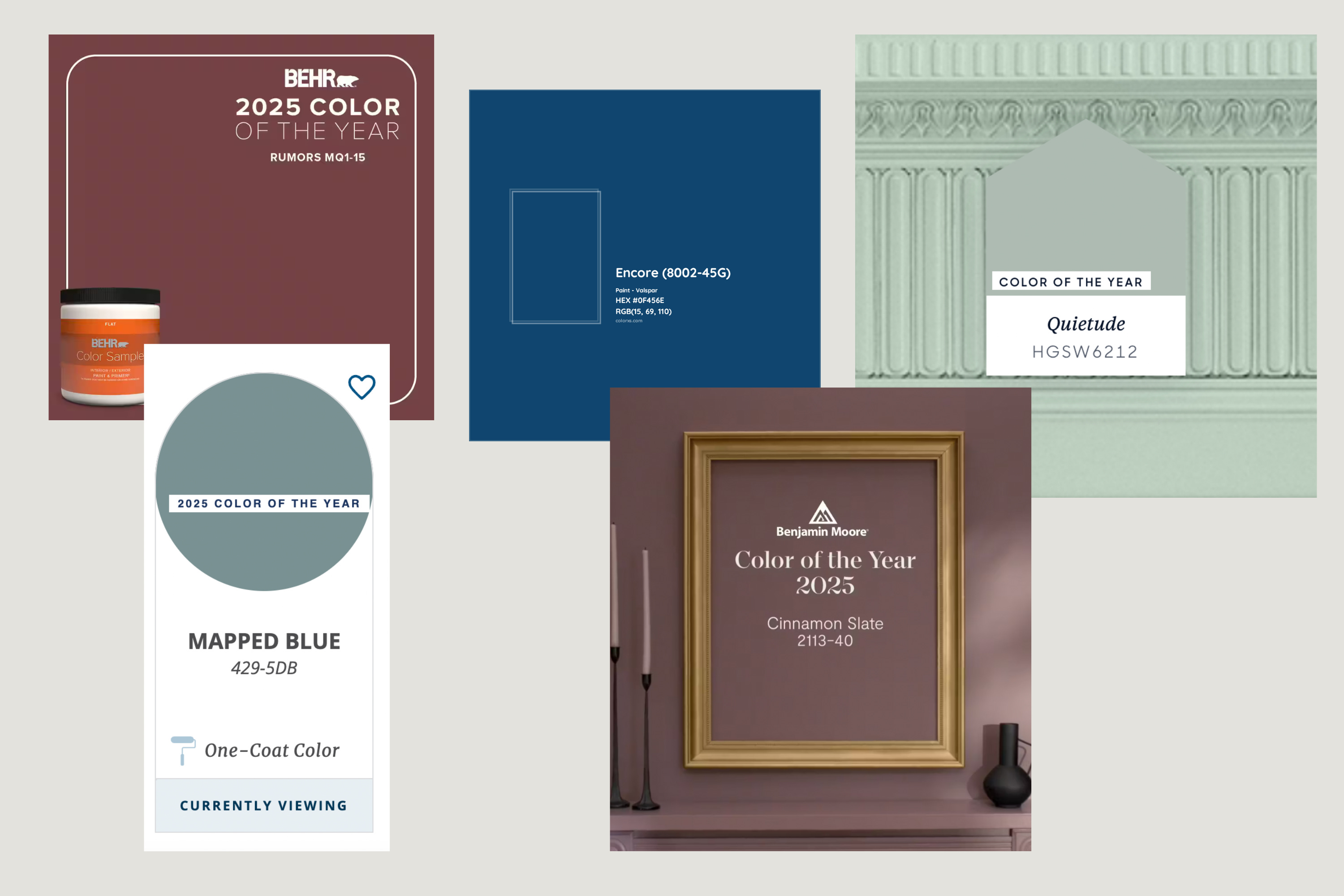
Behr: Rumors, “a luxurious ruby red adding warmth and rich allure.”
Valspar: Encore, a deep blue, “an anchoring shade that embodies constancy and confidence to let you create a joyful respite from the ebbs and flows of life.”
Dutch Boy: Mapped Blue, “a beautiful, medium-tone blue with slight yellow undertones, it adds modern charm to any space.”
HGTV Home by Sherwin-Williams (unclear if this is different from plain old Sherwin-Williams): Quietude, “a soft sage with a whisper of blue influence…soothes any space inside or out.”
Benjamin Moore: Cinnamon Slate, a “delicate mix of heathered plum and velvety brown.”
Before I get into what 2025 is trying to tell us, I want to first look at the past handful of years and color predictions from three major paint distributors — Behr, Sherwin, and Benjamin Moore:
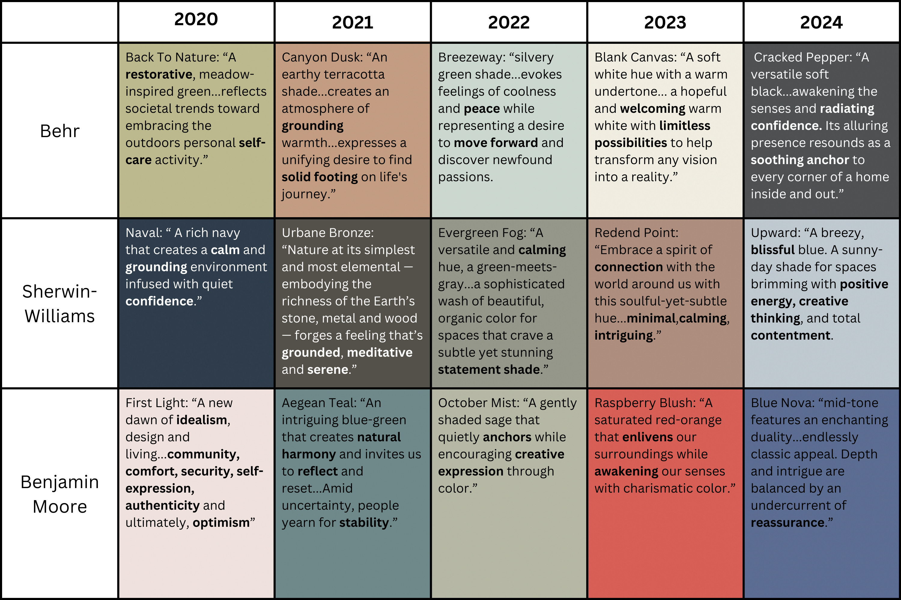
What I see here is a narrative being built around peaks and valleys: the American people are either uncertain and unstable, or they are confident and exploratory. Take Benjamin Moore: in 2020, the company tells us that we are in a place of optimism (despite being in a pandemic?) vs. the next year we are unstable. Sherwin-Williams, on the other hand, seems to take a similar tone each year, using the words “calm” and “grounding” consistently. (Either way, I can’t help but read every color description in a hushed voice, as if one is being ushered into the gates of heaven, or seduced by the narrator of a ‘90s Caress soap commercial.) These colors and descriptors attempt to diagnose the mood of the nation, yet it’s clear that there’s not always agreement.
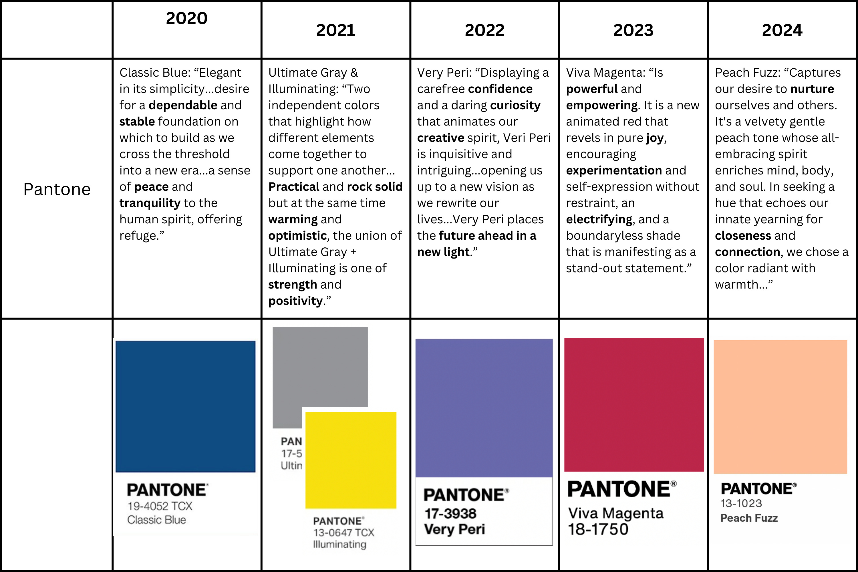
What I do see, looking at paint companies from 2020-2024, is that aside from Benjamin Moore’s “Raspberry Blush,” Colors of the Year do not take risks. This stands in pretty sharp contrast to Pantone, which prefers bold hues. Pantone can be more daring as it’s a guide to everything — there’s less risk in wasting money on a neon yellow dress than painting your dining room that color.
A paint company being risk-averse and rejecting a big swing makes sense to me. But there’s more to it than that. I tend to agree with the artist and writer David Batchelor when he says that the Western world fears color. In his 2000 treatise, Chromophobia, Batchelor writes, “It is, I believe no exaggeration to say that, in the West, since Antiquity, colour has been systematically marginalized, reviled, diminished and degraded.” His reasoning is complex but it definitely makes sense, especially in America — most Americans fear bold colors in their homes. (See FOR SCALE’s dissection of the “Beige-ification” of the home.)
Here’s what “INDUSTRY INSIDERS” have to say about “Color of the Year” announcements:
Price Latimer, co-founder Alkemis Paint: “While it doesn't seem to be a major game-changer from a revenue standpoint, color trends are an important engagement tool for customers…the neuroaesthetic component of how color influences our feelings and evokes emotional responses can also be used to set a certain emotive tone or idealistic vibe for the coming year.”
Anonymous former Director of Merchandising from a major U.S. furniture retailer: “Color of the Year makes for great marketing, but I haven’t found it to actually drive sales. We tend to see color trends hold across the home sector for a period of 3-5 years, with little impact from paint or color authorities.”
Kelsey Keith, design journalist and Creative Director at Herman Miller: “‘Color of the Year’ is absolutely a PR stunt. It's a way to manufacture ‘news’ around color when understanding color is a much deeper and more sensory experience. (All credit to Charli XCX for pulling off a much more sophisticated color PR stunt.)”
So, okay, yes, we should all be in agreement that a “Paint Color of the Year” announcement has no actual bearing on reality. Still, this might be the first year I’ve seen a paint company make an interesting choice.
::drum roll::
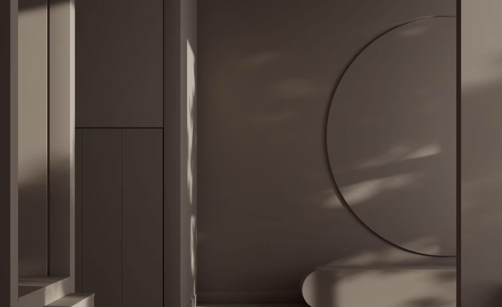
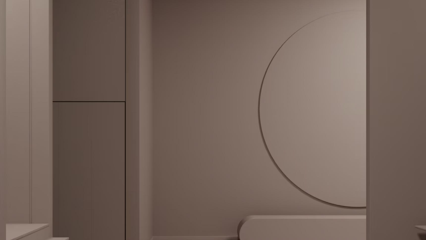
Cheers to Benjamin Moore for introducing Cinnamon Slate (terrible name). The company seems to have picked up on the interest in purples over the past year. But interestingly, the hue apparently has a lot of variation according to light. (I haven’t seen this color and I’m relying on BM’s site to reflect reality.)
In most marketing materials, Cinnamon Slate looks something like this:
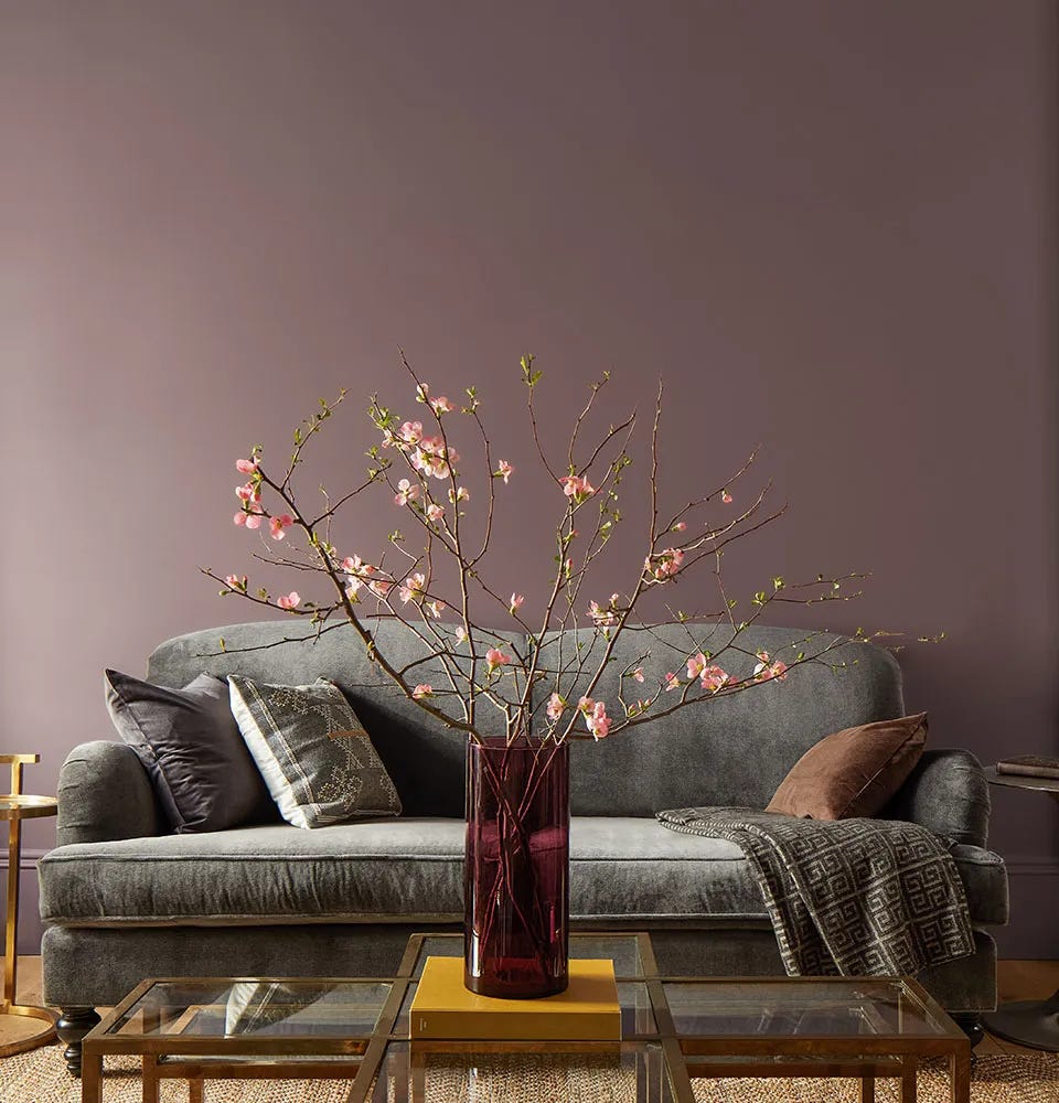
Yet, according to the light in your space, it can apparently look more like a taupe or a brown:
Anyhow. In summation: Color of the Year = PR nonsense. But this year, I liked Benjamin Moore’s slightly more “daring” choice.
Read More:
Schmatta is written by Leonora Epstein, a former shelter pub editor-in-chief. Follow at @_leonoraepstein. For consulting and collab requests, please visit my website to get in touch.
From the photos Cinnamon Slate looks a lot like Farrow & Ball's "Dead Salmon," which is a great color and is known to shape shift depending the time of day / lighting.