

The Coolest Interiors on TV Are on a Kids' Show
People: Shape Island on Apple TV. It's groundbreaking.

The animated kids’ shows I grew up with in the ’80s and ’90s were great — Nickelodeon in particular ushered in a golden era with Rugrats, Doug, Ren & Stimpy, and the rest. But with the exception of Hey Arnold, almost none of them paid much attention to architecture or interiors. We were usually plopped in some anonymous suburban living room.
These days, the shows I watch with my daughter feel more considered. Gabby’s Dollhouse, Bluey, even Yo Gabba GabbaLand have a distinct sense of place. (Granted, there’s still a whole genre of retina-searing animation populated by Stepford-y children with balloon heads, but I digress.)
One show, though, has completely floored me with its architecturally minded design: Shape Island on Apple TV+. Adapted from Mac Barnett and Jon Klassen’s children’s books Triangle, Circle, and Square, the series follows three anthropomorphic shapes as they navigate friendship. But what really hooks me are the environments: interiors and landscapes that nod to Brutalism, Bauhaus, Barragán, even Gaudí. It’s architectural, it’s oddly soothing, and it looks like nothing else in children’s programming.
But the environment for this trio’s adventures lends a cleverness that pleases me endlessly. We have structures and interiors that nod to Brutalism, Bauhaus, Barragán, Gaudi. It’s architectural, it’s weirdly calming, and it’s unlike anything I’ve seen before.
I spoke with production designer Paul Harrod — a very cool Portland-based dude whose CV includes Pee-wee’s Playhouse and Isle of Dogs — about how he built the world of Shape Island and why its sets feel so design-forward.
Q: You’ve worked on everything from Pee-wee’s Playhouse to Isle of Dogs with Wes Anderson. How did those experiences shape your path to Shape Island?
Those projects taught me how playful architectural stop motion can be. On Pee-wee’s Playhouse, I designed sets for the opening title sequence — it was all about color, whimsy, and forced perspective.
With Isle of Dogs, it was almost the opposite: 250 meticulously designed sets, many of which only appeared on screen for seconds, but every composition mattered. Both experiences gave me a deep respect for how design can shape character and mood, which carried right into Shape Island.
Q: What were your initial thoughts in transforming a kids’ book into a TV format?
From the start, the director Drew Hodges and I wanted the design to be minimalist without feeling alienating, and we settled on a muted palette to echo Jon Klassen’s illustrations. Apple did ask us to boost the colors in post, but the foundation stayed restrained and architectural.
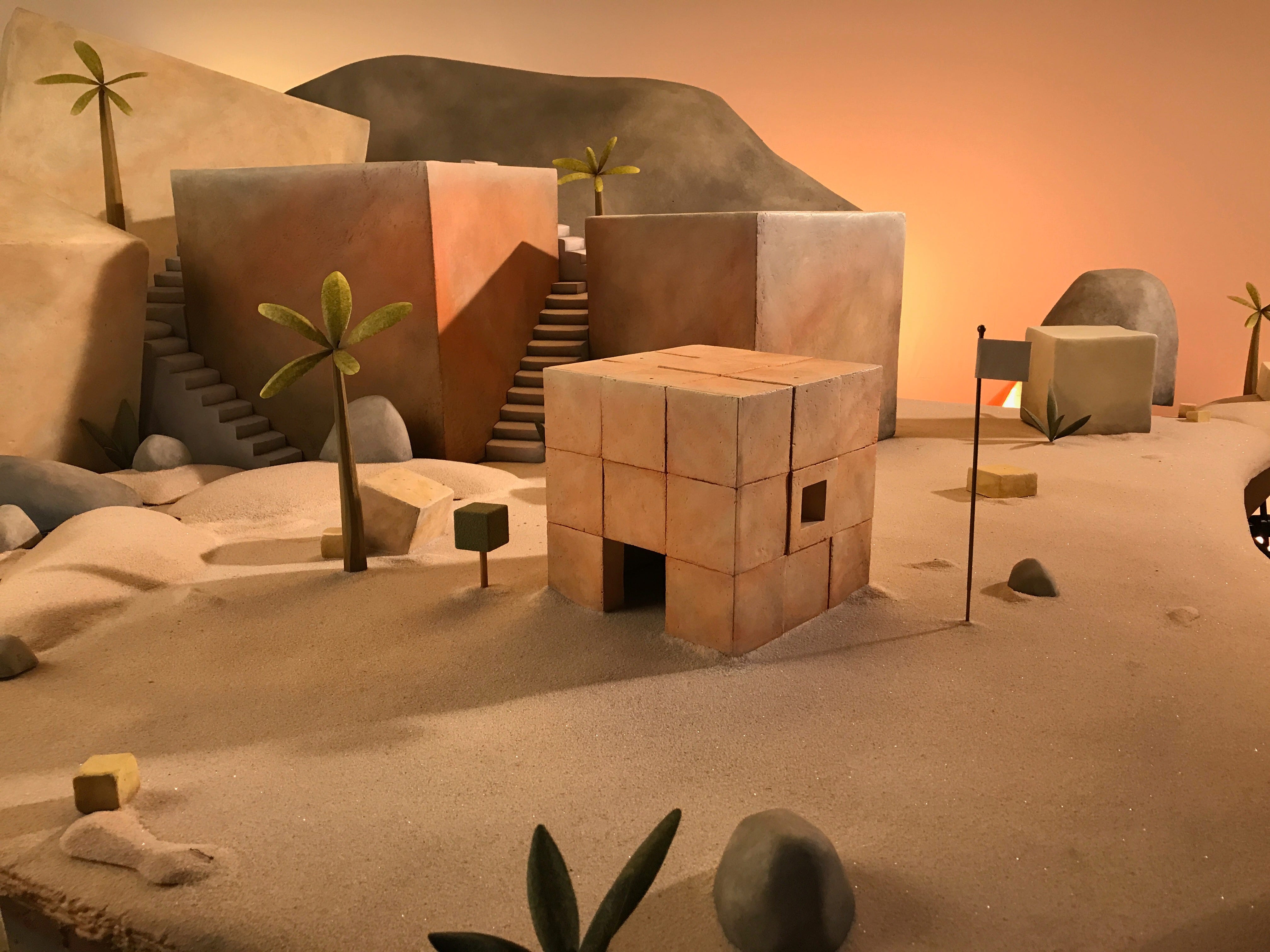
In the books, a square is a square. In stop motion, a square is a cube, a circle is a sphere, a triangle is a pyramid. We wanted the world to feel toy-like but not too literal. Rocks and trees couldn’t be overly realistic — they had to suggest materials without fully revealing them. That ambiguity was intentional.
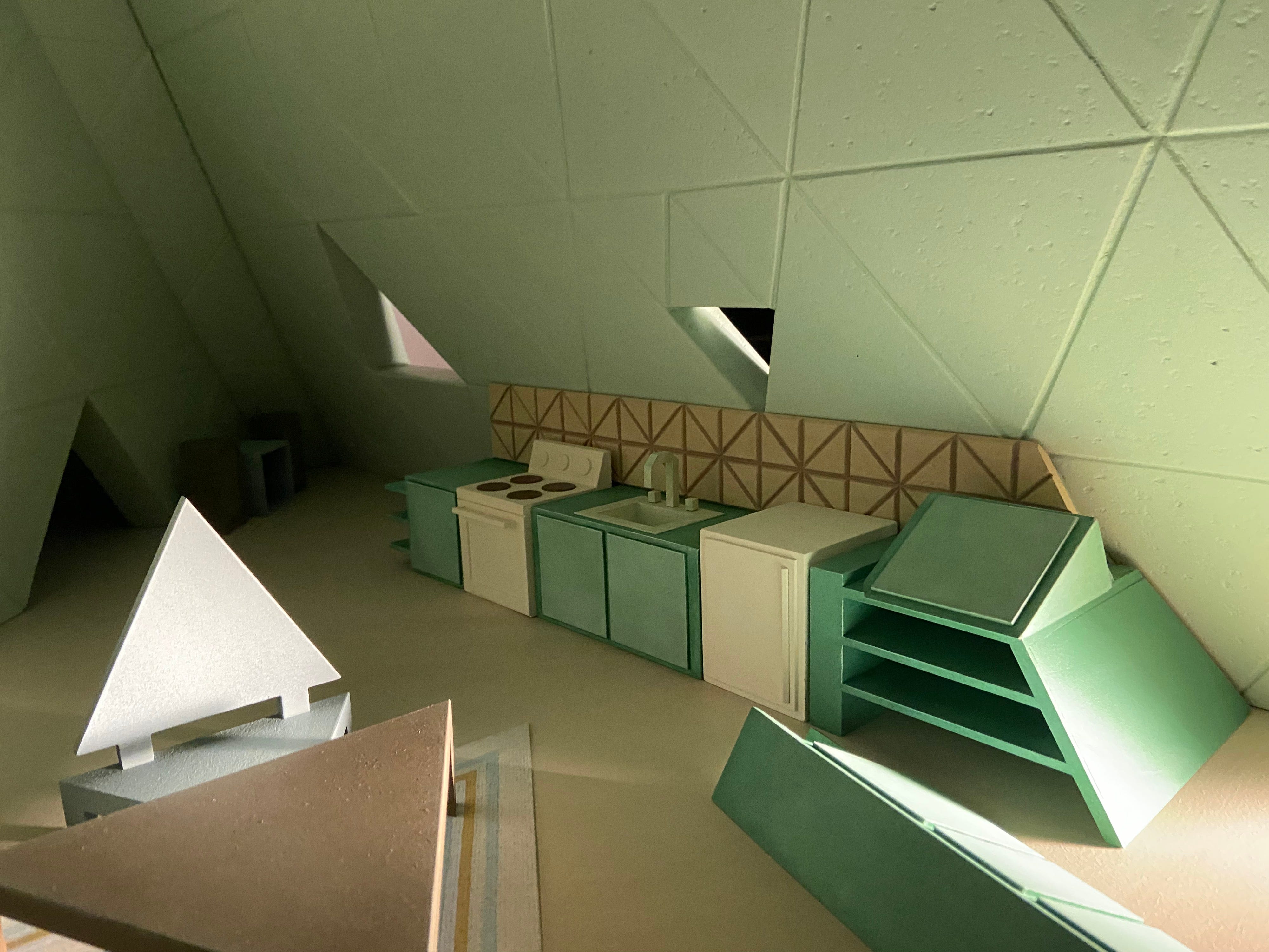
Q: Square’s house feels especially architectural. What were your references?
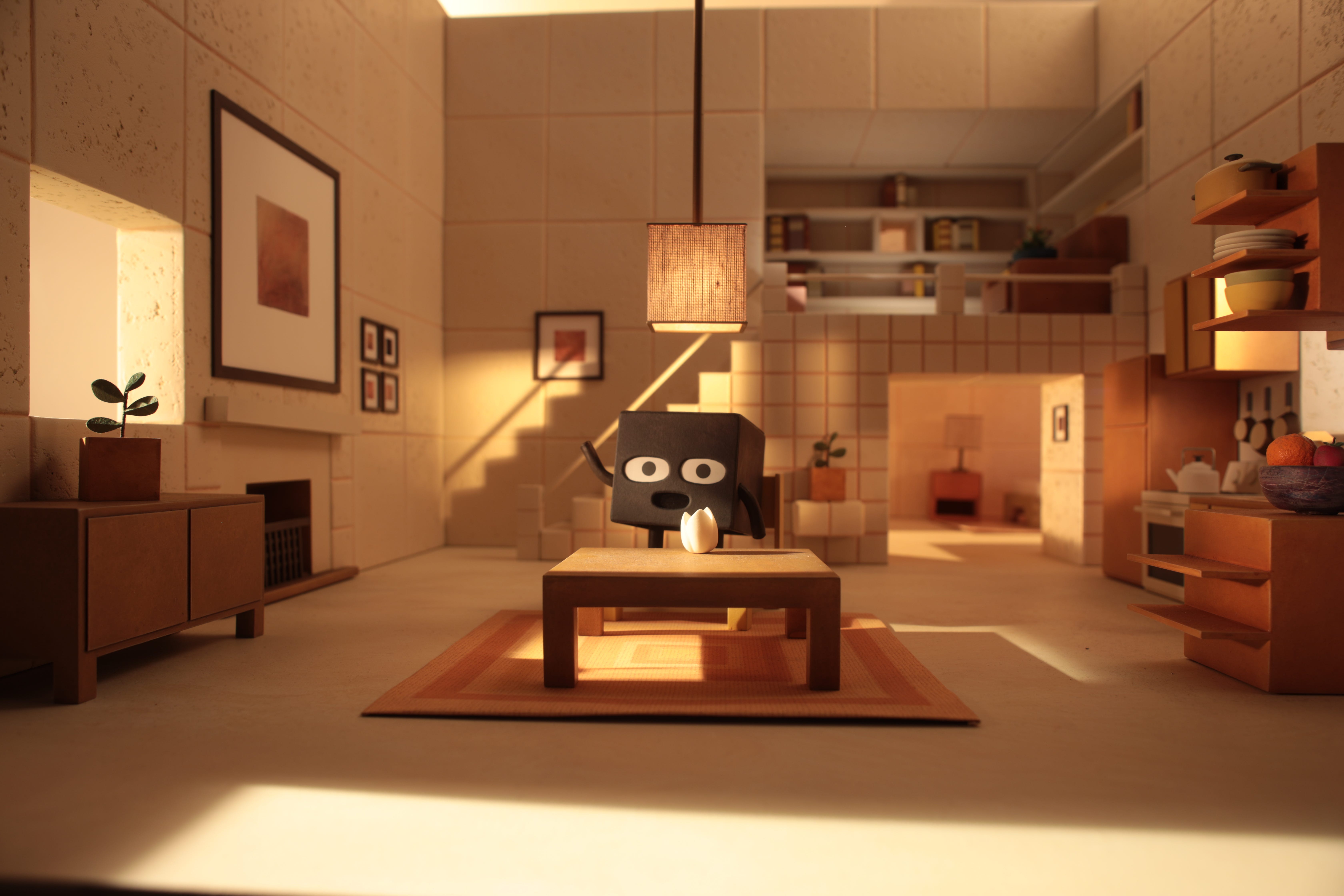
With Square's house, the foundation of it was Bauhaus — it just made perfect sense. He's square, so his home is going to be straight and narrow and all right angles. You're not going to find a curve anywhere in the place.
I also looked at the Japanese Metabolism movement — Kenzo Tange and modular housing plugged into central cores. It was about efficiency and rhythm. I drew from mid-century modern design too, especially the work of Dieter Rams at Braun: pared down, functional, rigorous.
Q: What about Circle’s house?
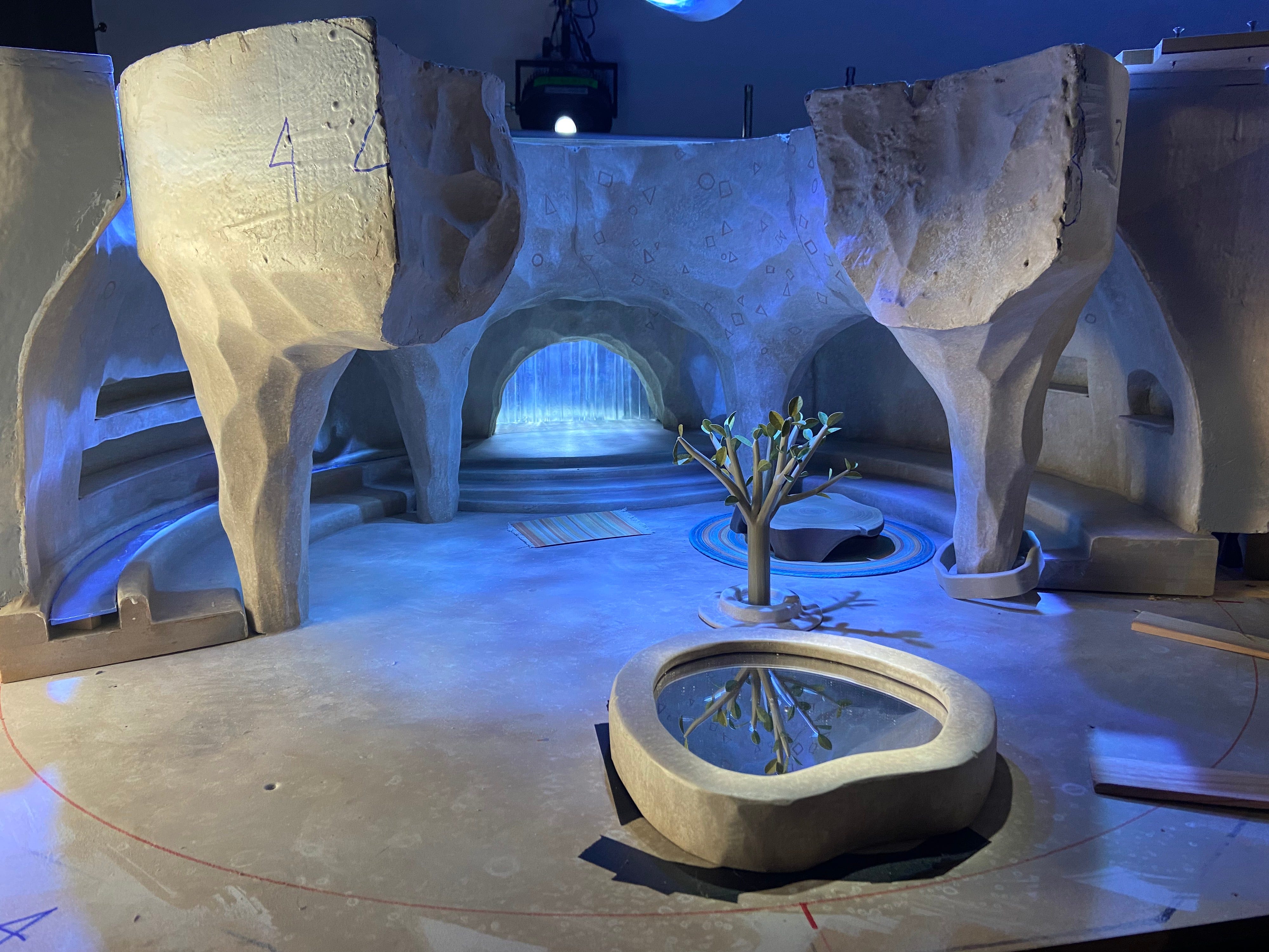
Circle’s home needed to feel cave-like but not scary — inviting instead of foreboding. I designed a central chimney to let light in, paired with a moat of constantly moving water running around the perimeter, sort of like one of those sushi-go-rounds. That refracted light beautifully across the space, creating a caustic effect. Our DP, Eric Adkins, figured out how to simulate moving water in stop motion, which is always tricky since you can’t use real water.
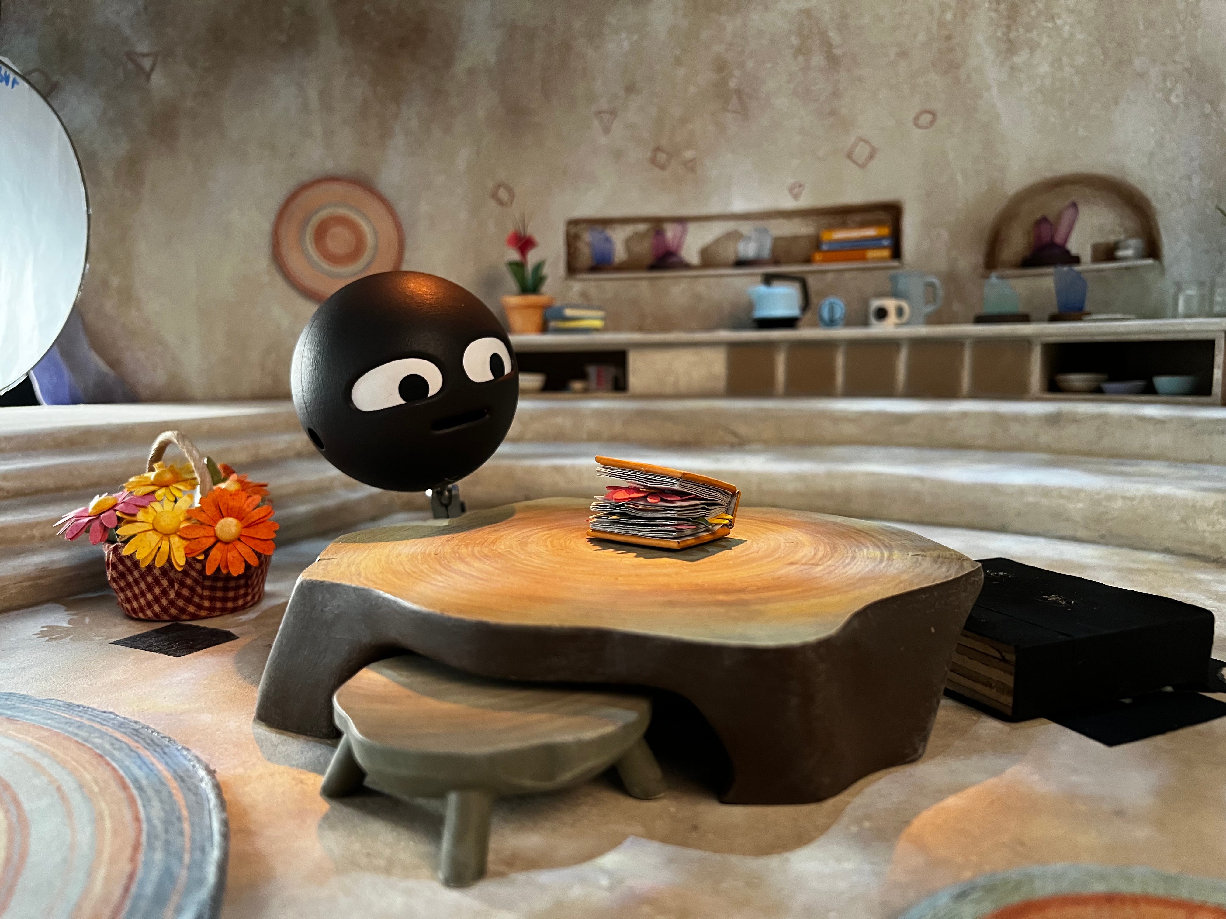
The space is essentially one large, round room with implied portals to other chambers. We see her kitchen, living area, and sometimes a hammock. I’ve always loved circular architecture — Ken Adam’s war room in Dr. Strangelove is a huge influence on me — and Circle’s house was an opportunity to explore that.
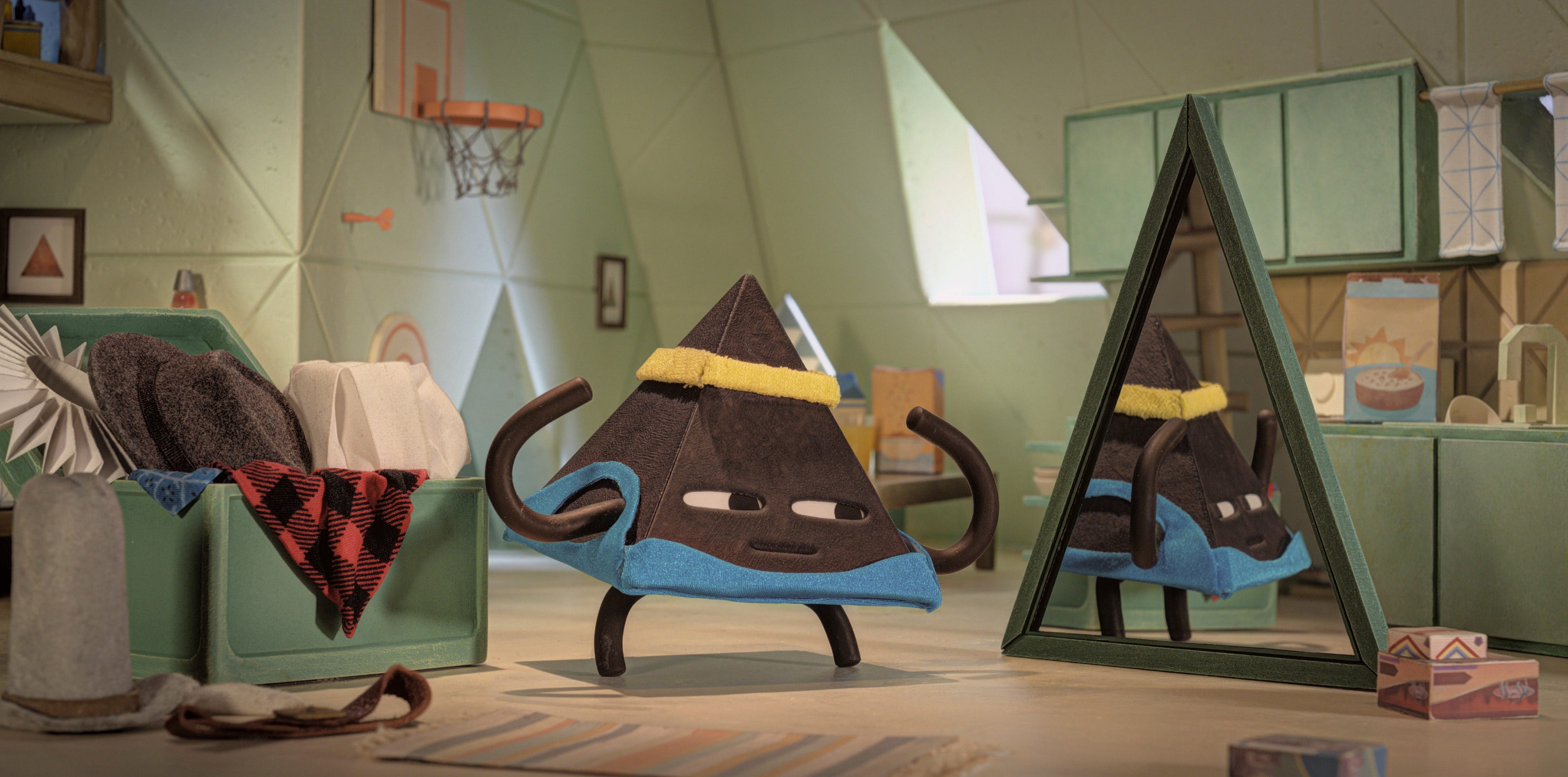
Q: And Triangle?
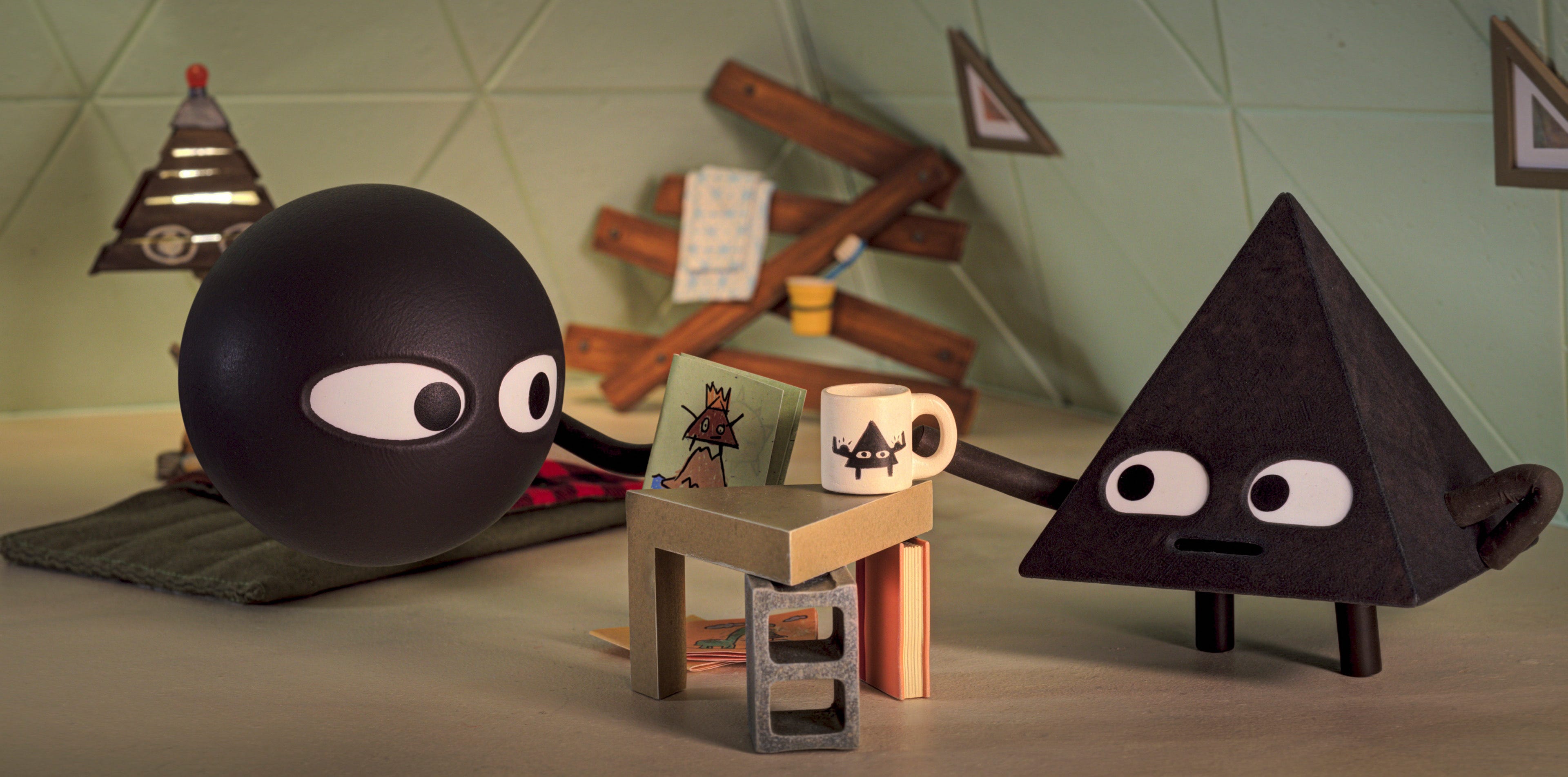
Triangle as a character is a very chaotic kind of guy — so, to be honest, I started from the idea of a messy, stoner-kid college dorm room. Once we decided he was going to live in a pyramid, we realized: there's nothing chaotic about pyramids. They're very structured. In the end, we took inspiration from the Louvre, creating a pyramid out of pyramids (or triangles). But on the interior, we could make everything intentionally cluttered and disordered, in contrast to the strict geometry of the form. It was about keeping his personality alive within such a rigid structure.
Q: Did you feel pressure to make the show more “kid-friendly”?
Yes, there’s often an assumption that children want bright primary colors, but that’s not always true. Think about Madeline or Eloise, both based on very limited palettes. Kids can handle subtlety — they respond to mood and atmosphere as much as to saturation.
Q: You’ve spent much of your career in stop motion. What’s the draw?
When I was a very young kid, I felt as though the stop motion world was something that could exist in my own bedroom. It has a tactile quality, a sense of being handmade. That’s what makes Shape Island work: it feels like a world you could construct from blocks and paper, but grounded with enough architectural thought to give it weight.
RELATED:
The Emotional Architecture of 'Bluey'

Today we’re talking about the architecture of the family home featured in the kids’ show, Bluey. And then we’ll cover some cool, current happenings in Australian design.
I don't have kids yet but this will be the first thing I put on when they're sentient enough 😍 fascinating interview and ofc LOVE isle of dogs
Great point - I have always loved the freedom and expressive nature of kids' shows.